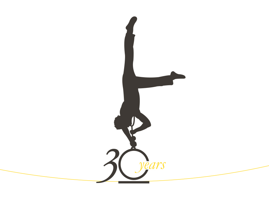
Ornare 30 years - Art Direction
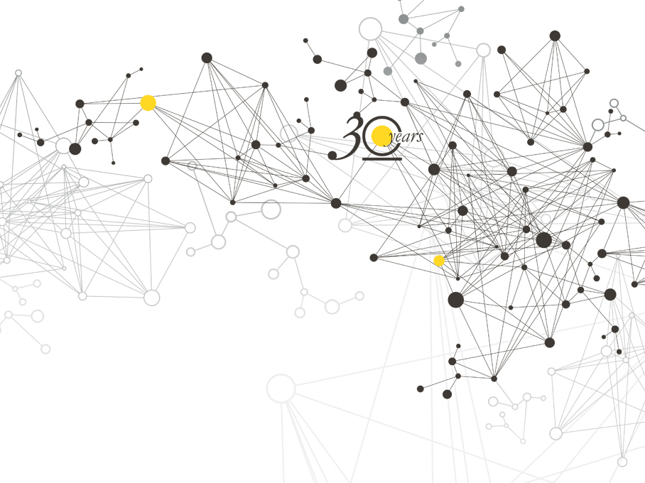
Ornare hits the furniture market with a renewed image in its 30th anniversary.
This renewal takes, amplifies and updates what was already set in the previous campaign of January 2014.
This renewal takes, amplifies and updates what was already set in the previous campaign of January 2014.
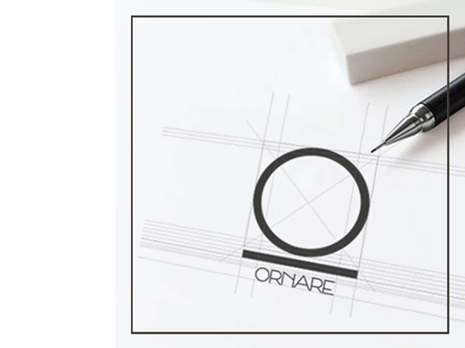
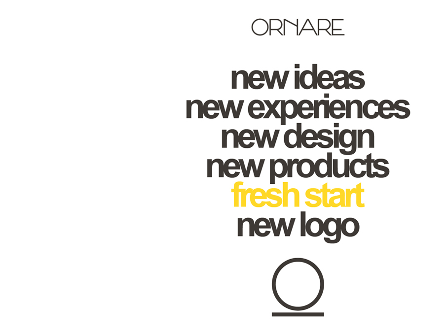
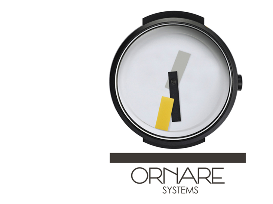
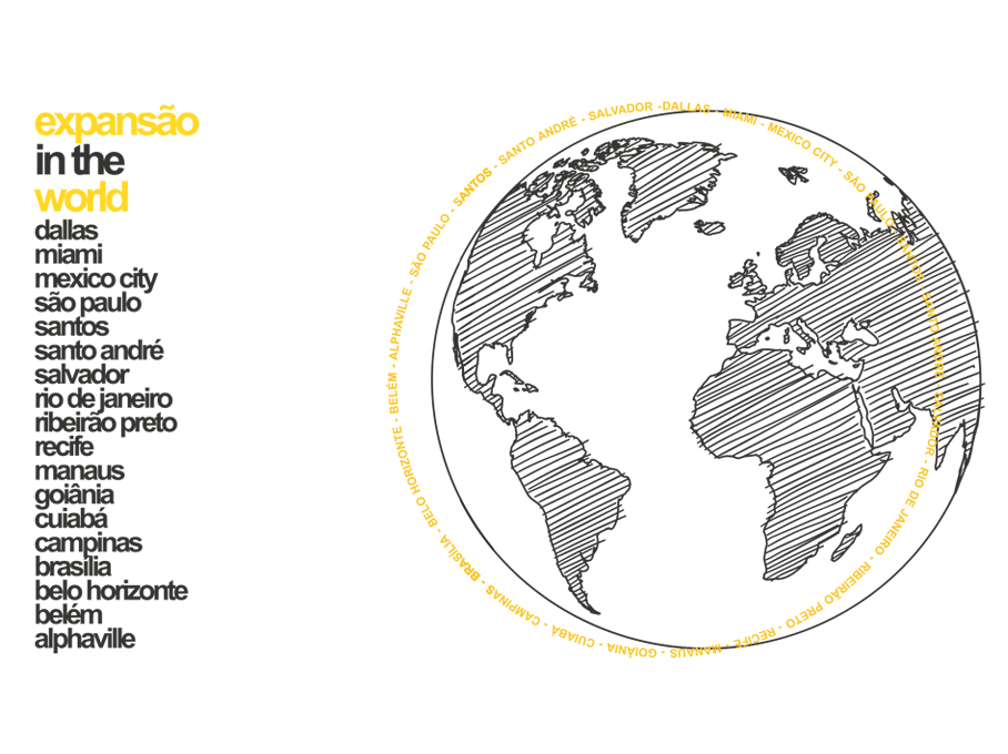
A circle and a line create Ornare’s new logo. The circle is the symbol of totality and its shape expresses fullness and harmony. The line returns to the earth, to the roots. Ornare’s universe has been growing for thirty years over solid roots and continuously looks for improving the quality of life of its customers.
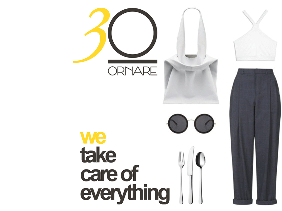
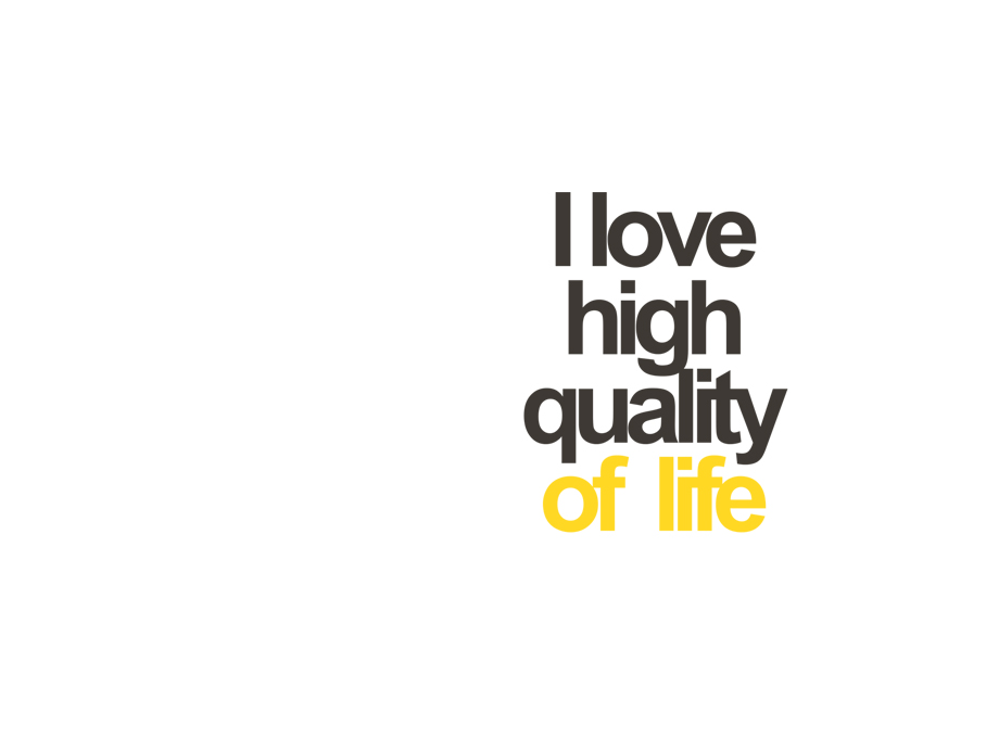
In 2016 the focus of Ornare’s vision is all about openness and wideness, and the new slogan “We take care of everything” couldn’t be other than the watchword, representing the new change of perspective. Translate into images this concept means to start from a total look and place an “inappropriate” element generating surprise, an element that opens a crack and changes the context, bringing the imaginary elsewhere.
---
Project:
Ricardo Bello Dias
Team:
Daniela Luchena
---
Project:
Ricardo Bello Dias
Team:
Daniela Luchena

Ornare 30 years - Art Direction
Ornare hits the furniture market with a renewed image in its 30th anniversary.
This renewal takes, amplifies and updates what was already set in the previous campaign of January 2014.
This renewal takes, amplifies and updates what was already set in the previous campaign of January 2014.
A circle and a line create Ornare’s new logo. The circle is the symbol of totality and its shape expresses fullness and harmony. The line returns to the earth, to the roots. Ornare’s universe has been growing for thirty years over solid roots and continuously looks for improving the quality of life of its customers.
In 2016 the focus of Ornare’s vision is all about openness and wideness, and the new slogan “We take care of everything” couldn’t be other than the watchword, representing the new change of perspective. Translate into images this concept means to start from a total look and place an “inappropriate” element generating surprise, an element that opens a crack and changes the context, bringing the imaginary elsewhere.
---
Project:
Ricardo Bello Dias
Team:
Daniela Luchena
---
Project:
Ricardo Bello Dias
Team:
Daniela Luchena


